more paintings!
Aug. 31st, 2023 11:13 amIt's really getting close, now -- we leave in two weeks!
I've been mostly just continuing to practice slowing down and simplifying scenes, but also trying out some different methods and styles.
These first two are from an photo book / travel ad (?) I picked up a couple of years ago at a library sale. It's trilingual with Italian, Chinese, and English and seems to be trying to convince Chinese tourists to visit a certain region of Italy? On top of the lovely photos of the Italian countryside, it also has a bunch of little essays trying to marry Italian and Chinese culture -- kind of an interesting read.
Anyway... these were done with straight watercolor and very little pre-planning, whereas the previous ones all had extensive sketches in Bic pen.
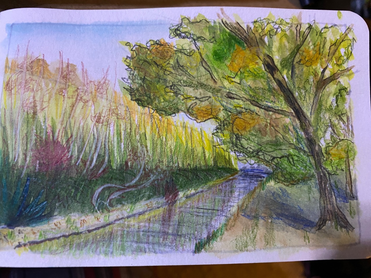
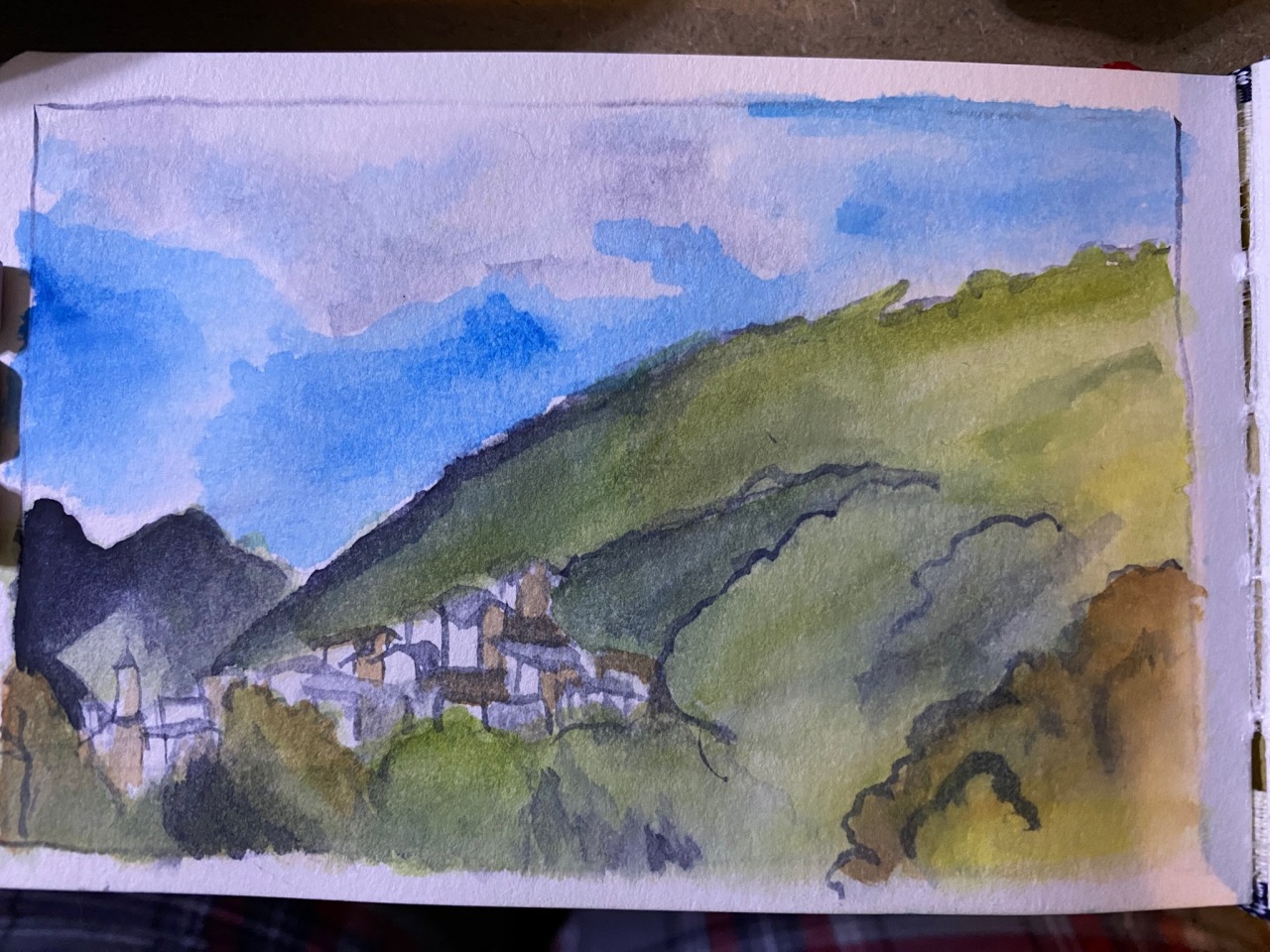
While I think these did turn out fairly cute, they're a lot less detailed than the other ones. Also, this paper is a little funky and doesn't like it if you get it very wet, so it's kinda difficult to do a lot of normal watercolor techniques. The first one in particular I thought was lacking structure, so I added some more details with colored pencils... and completely lost the plot with the tree again, rip.
Also, after doing this, I realized: yeah, trying to paint on location would look so ridiculous. Like, I have a pretty small palette, only a bit bigger than a deck of cards, but when fully unfolded, it looks like I've got a Duel Disk from Yugioh on my arm! (To be fair, though, this would make such a badass watercolor palette! They sell enamel paint you could put in the grooves to make a mixing space, also..)
The next few were done after watching some Youtube tutorials and have a much heavier focus on linework. These also had a detailed sketch layer underneath with a Col-erase Pencil rather than a pen, and, while the end paintings turned out really good, I ended up being a bit more perfectionistic rather than loose. Like, when I finished the sketch for the second one, I was kinda scared to actually ink it, which is never a good sign... Hmm.. The first is drawn from a photo reference from Pinterest of a Japanese garden, and the second was another photo from the Italian book mentioned earlier.
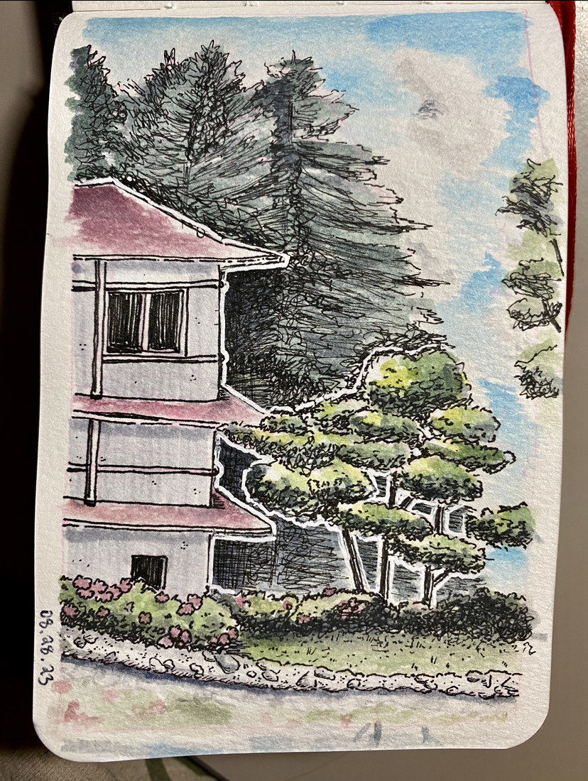

Even if they're still a little wonky in places, I'm still really, really happy with these! Like, I was looking back at some old paintings from high school and you really could not imagine the improvement! It even made me think about emailing my old AP Art teacher, lol.
And, again, I benefit greatly from structure, so some techniques I found really helpful for dealing with trees were:
It just helps me parse all the complexity and chaos of a tree better if I know what sorts of things I should be looking for, rather than just trying to look at it all at once and short circuiting.
Similarly, there was another video from Stephen Travers about how to simplify very complex, chaotic scenes like beds of wildflowers, by drawing some very detailed in the front ('eye grabbers') and getting less detailed as you go back, paying attention to negative space, etc. Again, very helpful! (Though, since this video is specifically talking about pen drawings, it may need some tweaking when working with pen and watercolor...)
Obviously, more practice is required, but I think I’m on the right path, at least!
(ノ´ヮ`)ノ*: ・゚
I've been mostly just continuing to practice slowing down and simplifying scenes, but also trying out some different methods and styles.
These first two are from an photo book / travel ad (?) I picked up a couple of years ago at a library sale. It's trilingual with Italian, Chinese, and English and seems to be trying to convince Chinese tourists to visit a certain region of Italy? On top of the lovely photos of the Italian countryside, it also has a bunch of little essays trying to marry Italian and Chinese culture -- kind of an interesting read.
Anyway... these were done with straight watercolor and very little pre-planning, whereas the previous ones all had extensive sketches in Bic pen.
While I think these did turn out fairly cute, they're a lot less detailed than the other ones. Also, this paper is a little funky and doesn't like it if you get it very wet, so it's kinda difficult to do a lot of normal watercolor techniques. The first one in particular I thought was lacking structure, so I added some more details with colored pencils... and completely lost the plot with the tree again, rip.
Also, after doing this, I realized: yeah, trying to paint on location would look so ridiculous. Like, I have a pretty small palette, only a bit bigger than a deck of cards, but when fully unfolded, it looks like I've got a Duel Disk from Yugioh on my arm! (To be fair, though, this would make such a badass watercolor palette! They sell enamel paint you could put in the grooves to make a mixing space, also..)
The next few were done after watching some Youtube tutorials and have a much heavier focus on linework. These also had a detailed sketch layer underneath with a Col-erase Pencil rather than a pen, and, while the end paintings turned out really good, I ended up being a bit more perfectionistic rather than loose. Like, when I finished the sketch for the second one, I was kinda scared to actually ink it, which is never a good sign... Hmm.. The first is drawn from a photo reference from Pinterest of a Japanese garden, and the second was another photo from the Italian book mentioned earlier.
Even if they're still a little wonky in places, I'm still really, really happy with these! Like, I was looking back at some old paintings from high school and you really could not imagine the improvement! It even made me think about emailing my old AP Art teacher, lol.
And, again, I benefit greatly from structure, so some techniques I found really helpful for dealing with trees were:
- The Virtual Instructor's idea of breaking down clumps of leaves into smaller shapes and then shading each clump separately. As a result, I've been going around town trying to look at trees as if they were low poly, like the ones from Mario 64 and it's just kinda fun! Also, somewhat related: there's the Japanese practice of Niwaki, where you trim the tree into specific shapes.
- Another video from Stephen Travers gives some basic variables to keep in mind when drawing different types of trees to help distinguish them:
- texture of silhouette (rough and jagged vs soft and rounder, etc)
- shape of silhouette (more circular vs more conical, dense vs sporadic, etc)
- general texture of leaves (hanging down like a weeping willow vs rigid like pine needles, etc)
It just helps me parse all the complexity and chaos of a tree better if I know what sorts of things I should be looking for, rather than just trying to look at it all at once and short circuiting.
Similarly, there was another video from Stephen Travers about how to simplify very complex, chaotic scenes like beds of wildflowers, by drawing some very detailed in the front ('eye grabbers') and getting less detailed as you go back, paying attention to negative space, etc. Again, very helpful! (Though, since this video is specifically talking about pen drawings, it may need some tweaking when working with pen and watercolor...)
Obviously, more practice is required, but I think I’m on the right path, at least!
(ノ´ヮ`)ノ*: ・゚
