This was a few weeks ago now at this point, oops, but, yeah. My actual birthday was back in February but the weather's always crappy then, so we went in early May instead.
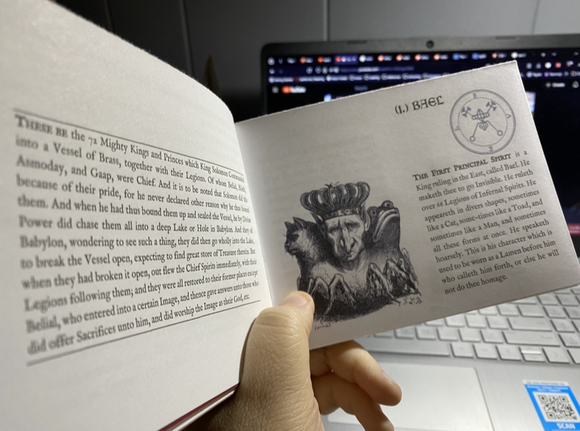
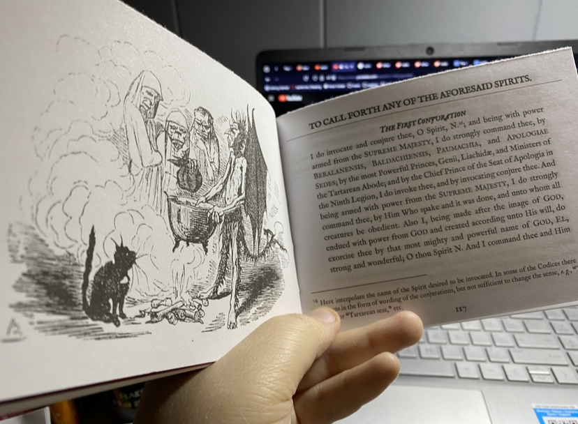
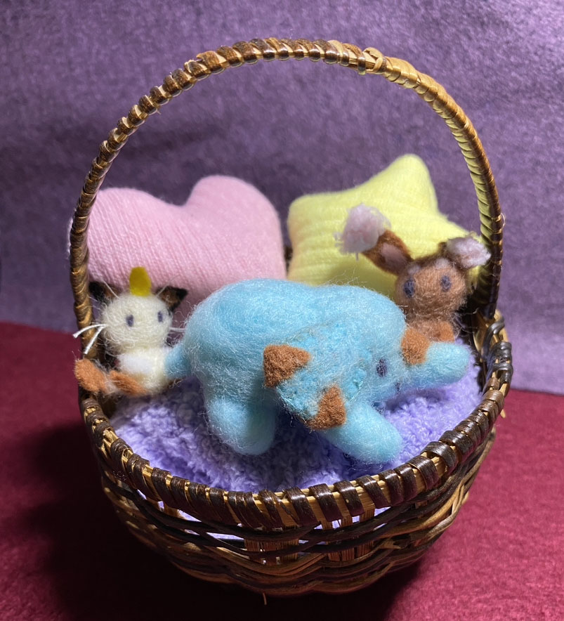
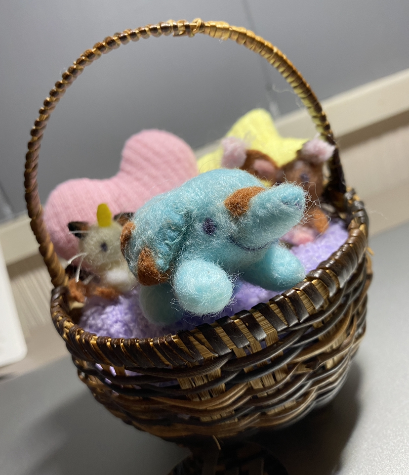
A few pages from my actual journal, mostly just to show off some cute stationery I bought!
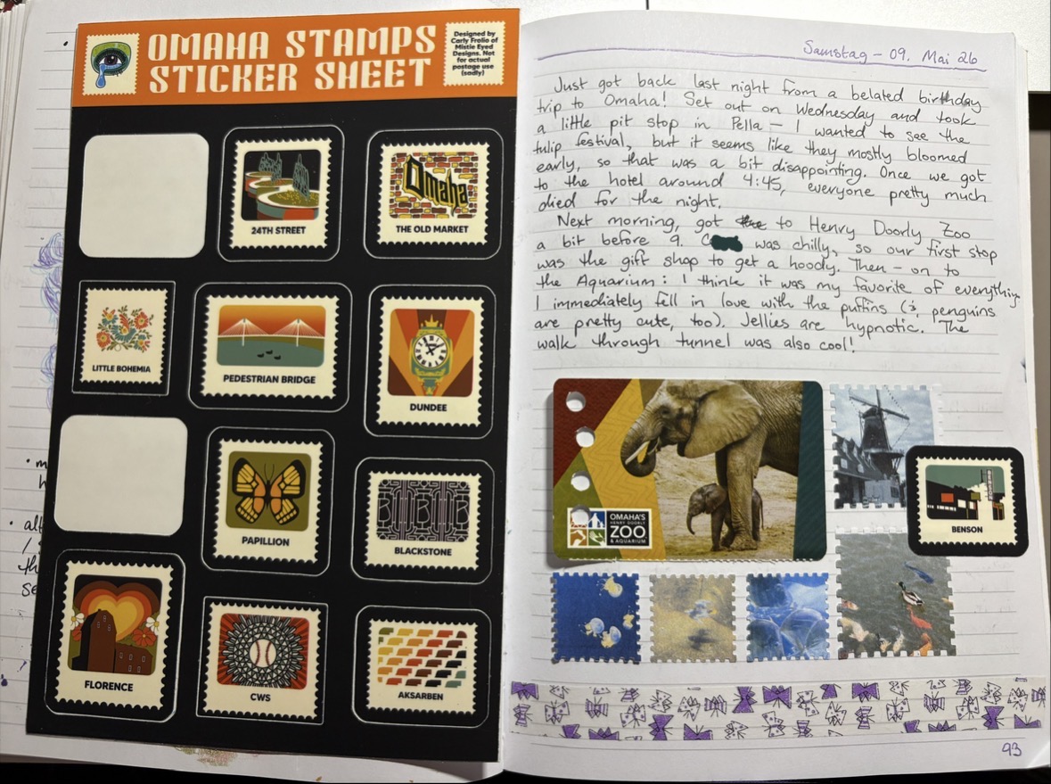
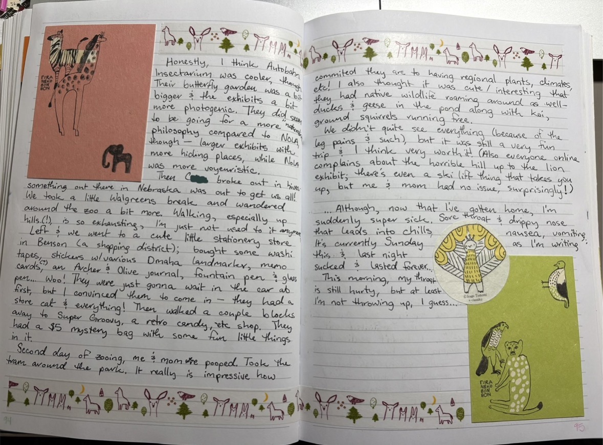
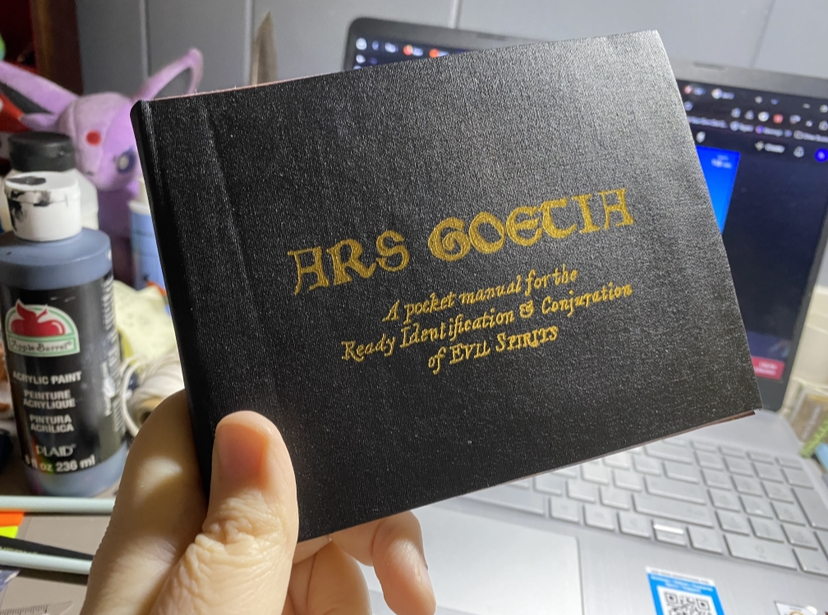
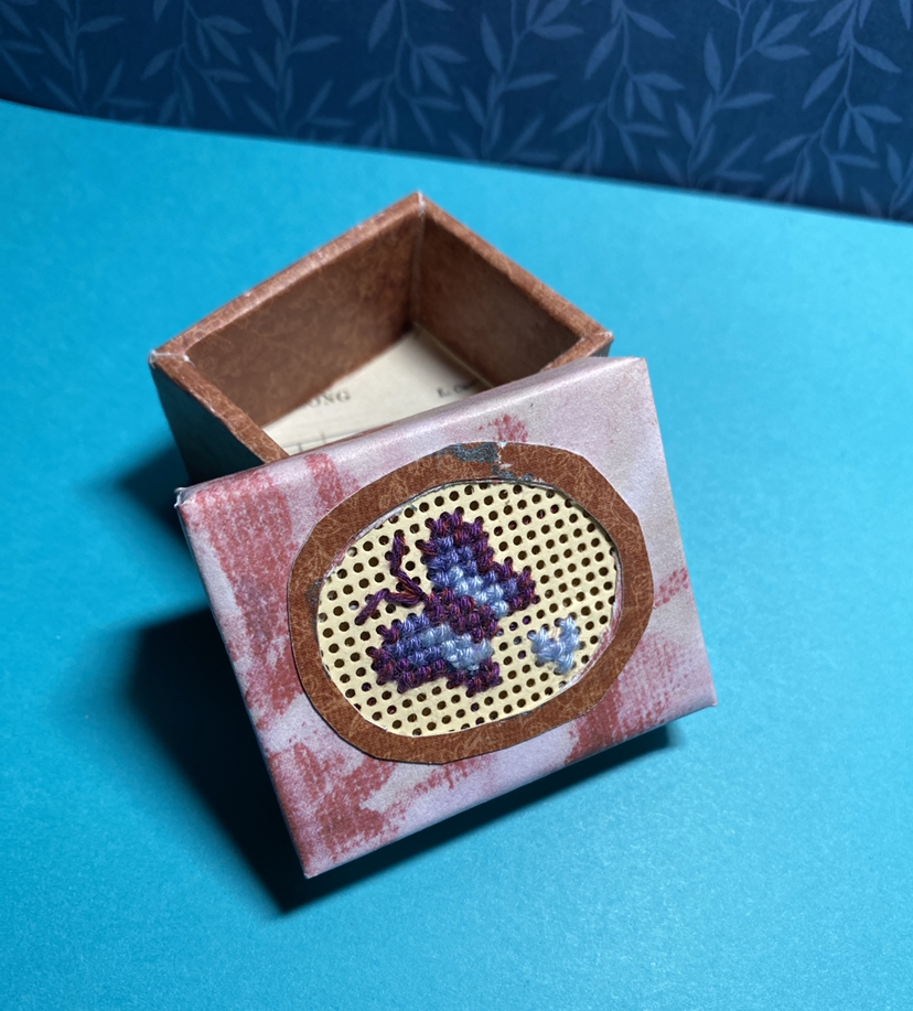
I thought the notecards and washi tape were an interesting style and thematic with the trip. I wanted to walk around the actual zoo gift shop more (I saw they had some nice journals!), but we left abruptly..
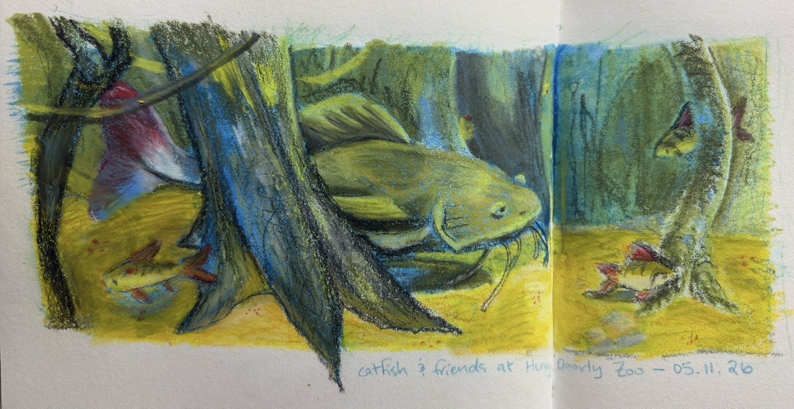
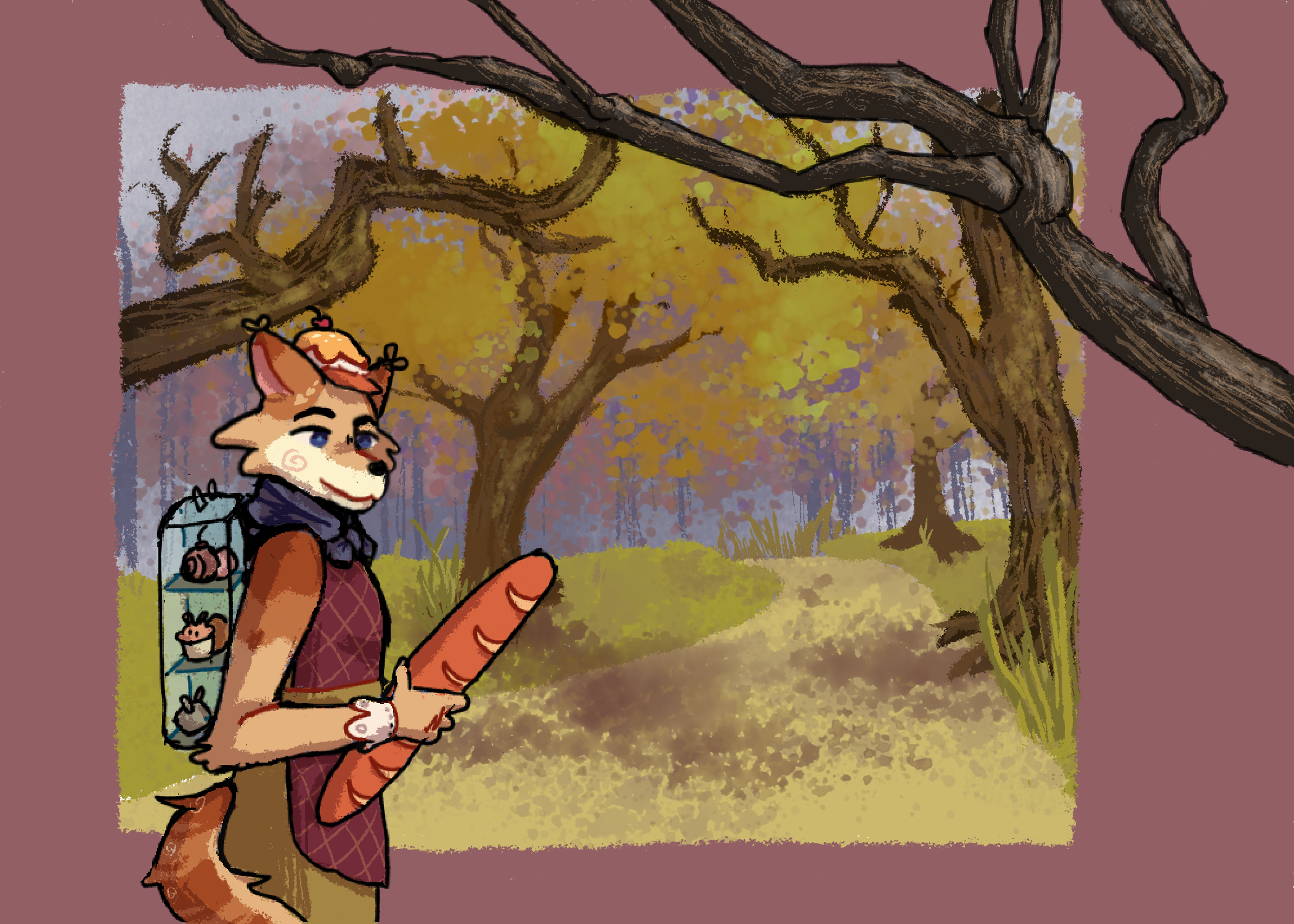
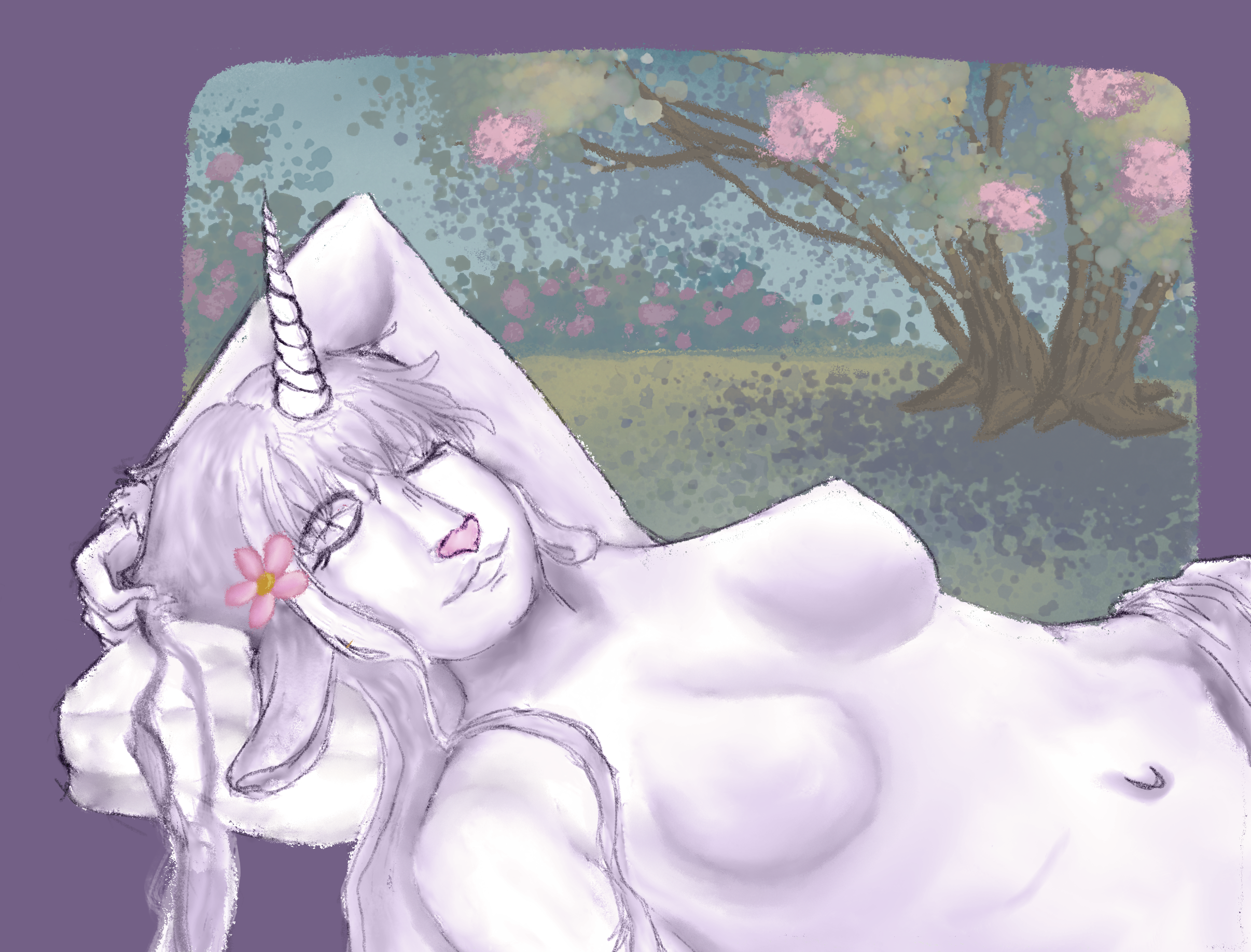
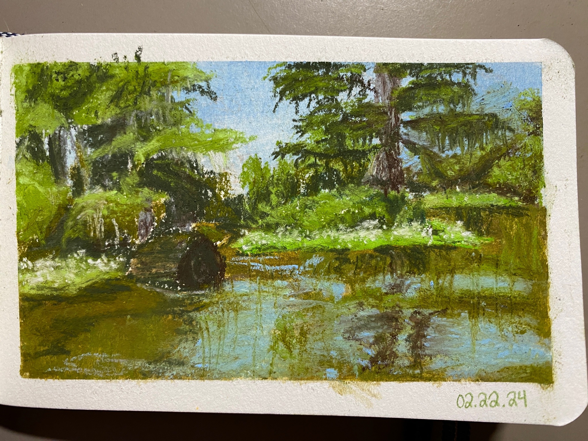
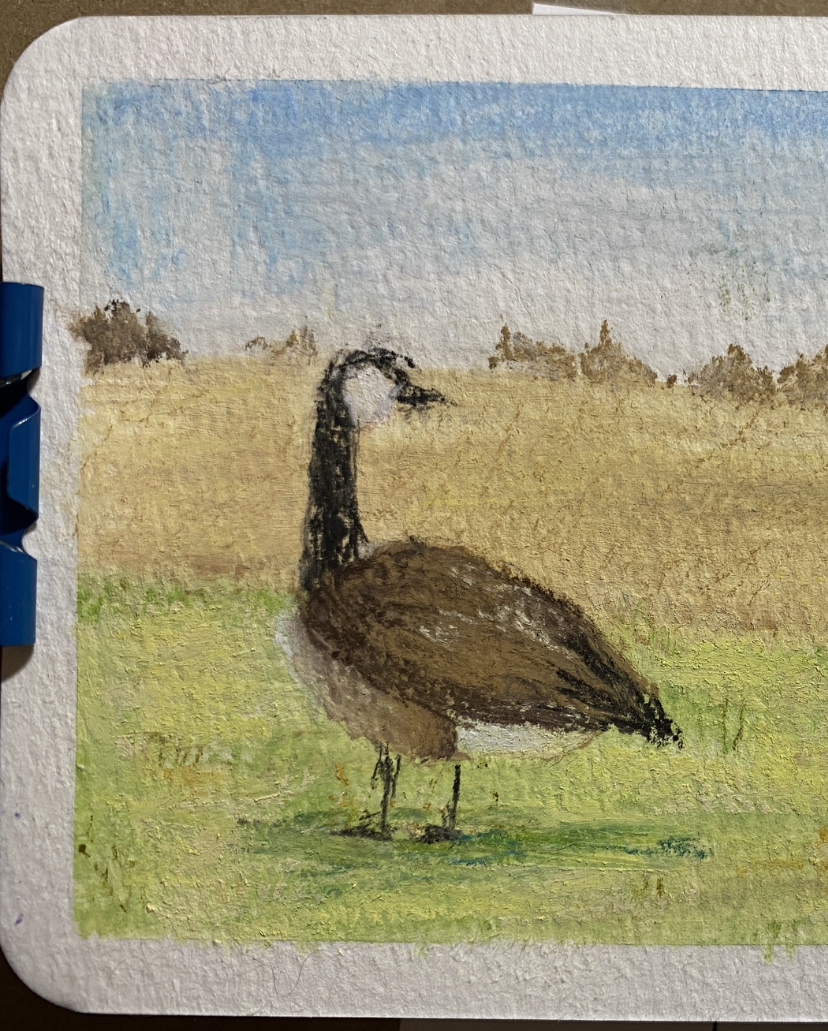
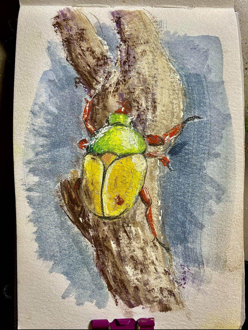
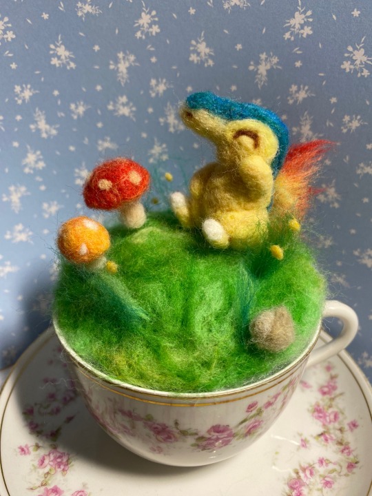
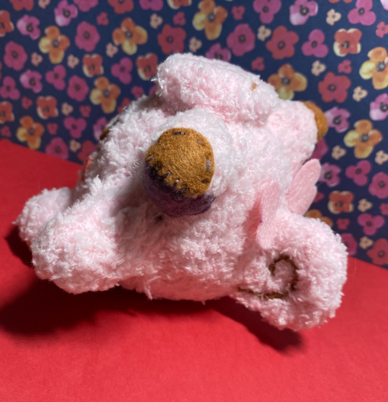
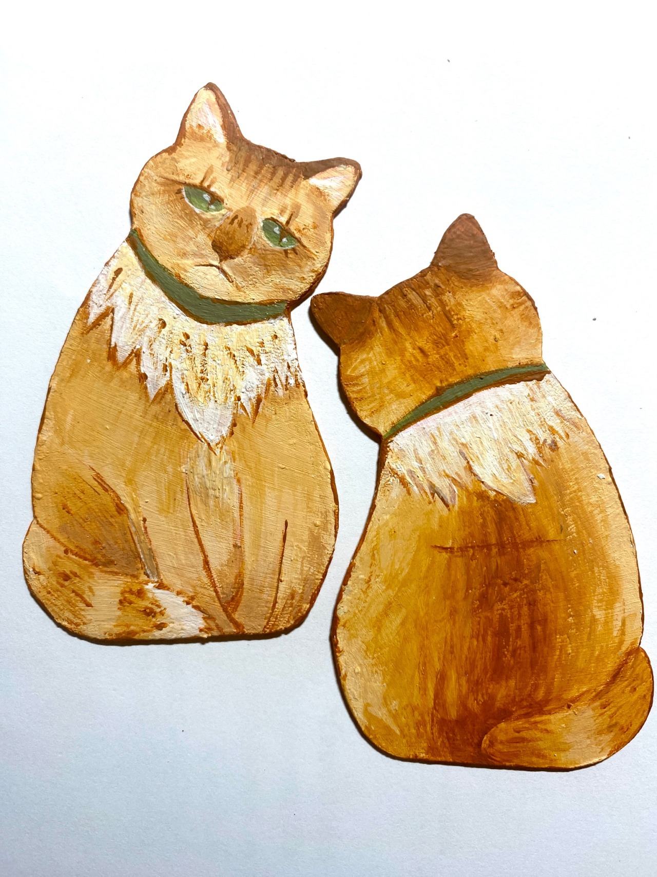
I took a lot of nice photos to use as references for paintings. So far, though, I've just got a couple of sketches and this fella, made with Neocolor IIs and some neon acrylic ink:
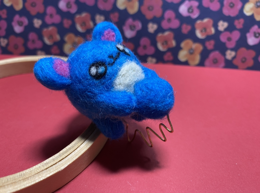
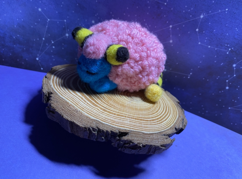
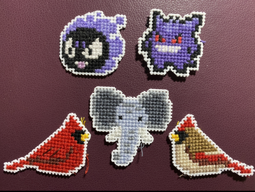
I have more planned, but I keep getting distracted by different little side quests...
- I was invited as an alternate to my coworker's bunco group that's been meeting for the last 30+ years; they apparently all met when their kids were in showchoir back in the day and haven't missed a month since. This was actually my second time going, but the first was a bit more awkward; I'm too young to understand their references or get inside jokes in the group, but also too old to explain Tiktok memes their grandkids are into, rip. :/ This time, I actually did have something to talk about, though--
- I finally got my garden started! It's just a couple of planters (with trellis/fences attached) in my backyard with roma tomatoes, cucumbers, bell peppers, and a few mini watermelons planted, but I'm excited to see how it goes! (I think I'll hold off on the corn for a while, to see what everything else is like.)
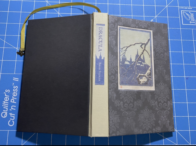
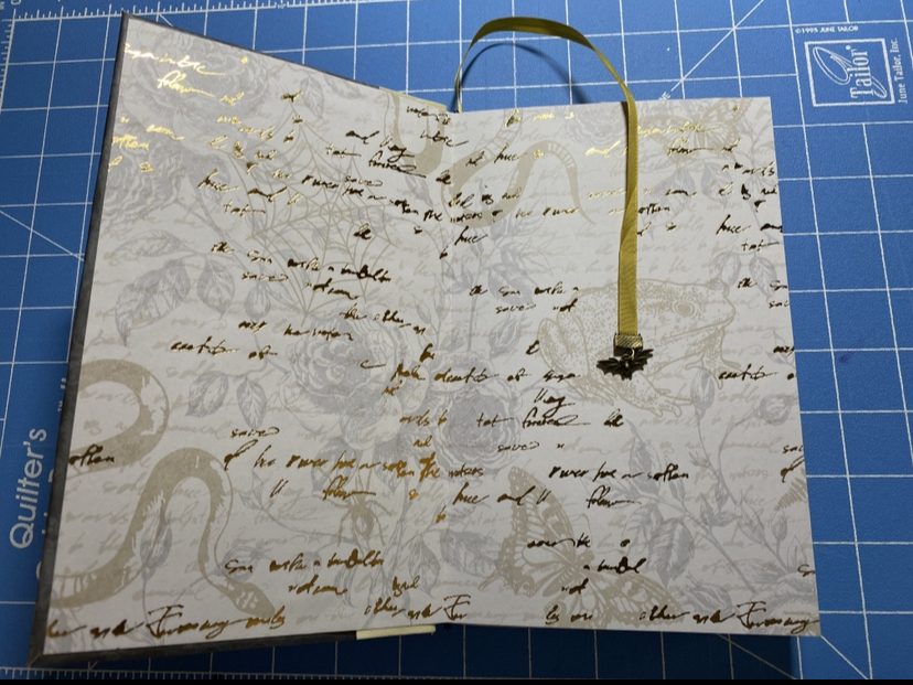
- Also, one of my days off, I suddenly got the desire to switch one of my old laptops that's just been rotting in the corner for a few years to Linux Mint. A couple of things pushed me over the edge: I feel guilty about letting perfectly good (albeit annoyingly slow) computers go to waste, considering all that goes into making them; additionally, this fellow was stuck on Windows 10, anyway. Also, I read that article a while ago about how the French government is planning on switching to Linux, and I thought that was cool and it brought Linux back into my mind, lol. I saw Labex's Linux Journey recommended a few places so I started reading through that, then followed the official instructions on the Linux Mint site; surprisingly easy and painless (once I realized you can't boot from an SD card, that is...)! I thought it would be difficult to navigate a new operating system (like the few times I had to use a Mac in college were so disorienting ( ꩜﹏꩜; ) ), but this has been very pleasant and usable from the get go! And the computer is actually tolerable to use now without taking 5 minutes to register a single click! *gasp* Excited to fiddle around with it more!! (I might install it on my main computer, too, eventually... I ditched Photoshop a while ago, and I only really use Word for typesetting books, but it's not even really made for that anyway and if I learn how to use LaTeX, that'd work so much better...)
Anyway, thanks for reading and hope everyone has a nice day! ^^


